
What is good design? Yellow, green and white-out are not!
14 July 2016 By Northern Lights
I have got two pet hates in design at the moment – white out (where the font is in white against a coloured background); and the colours of acid yellow and lime green.
The colours themselves are favourites of mine – for clothes. But in my view, they just don’t work as corporate colours.
I recently showed a designer, whom I respect, this piece of design below. I said how difficult it is to read the words ‘financial and professional services’. To my complete surprise he completely disagreed. ‘I like it’, he said. So that led me to consider, what is good design?

What is good design for?
Of course, design covers everything from ‘art’ to product design – kettles to chairs – to the design that I am interested in, that of design for communications.
In communications, we are using design to get a message over. It has to have impact, give simple messages that the mind remembers and engage you. That is partly achieved through words but also how those words are conveyed in print, online, in presentations.
I have been collecting examples of what I think are poor design for a while. This image of the Brexit information leaflet beautifully summed up the role of design for impact. This leaflet was posted to every household in the UK. On the left is the message of the Remain campaigners, on the right is the Leave.
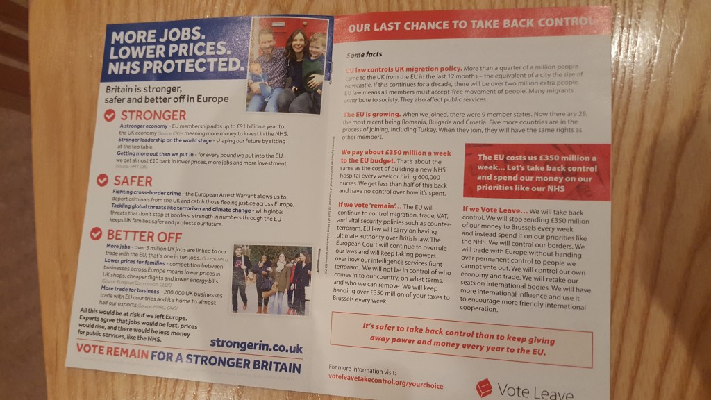
The left has headings that stand out, clarity of key points, impact so that even as you pick it up to put it in the bin, you take on board a few messages. The website is memorable and stands out, drawing you to go online and find out more.
In contrast, the right hand page has little impact. What do you take in at a glance? Of course, the Leave campaigners won their argument, so you could say ‘it worked’ which is the ultimate test of good design. But in this article on eight reasons why Leave won the UK’s referendum on the EU, design and communications are not mentioned.
So what are the elements of good design? Here are my personal rules for good communications.
1. You have to be able to read it
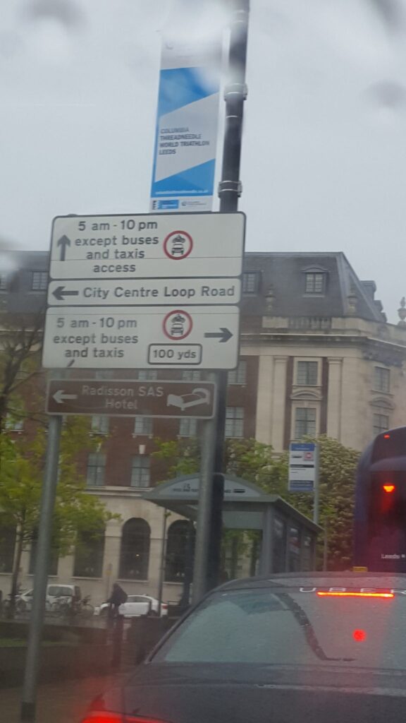
I took this photo in a city centre. It was raining, but you can see the contrast between the road signage which is clear and easy to read and the promotional banner above it. I was pretty close to this when I took the photo but you can’t read any messages as to what is being promoted – and the poor sponsors’ logos are mere blobs.
2. White-out should be on dark backgrounds
This brochure neatly demonstrates this point. The white-out text almost disappears to the eye, because it is against a weak colour background. White-out works if it is against blocks of black or dark colours.
3. Use colours that work at a distance
This is where my hate of yellow and green for design comes in. They disappear from a distance. These days when people take photos to share on social media, it becomes even more important – if the content on your slides is disappearing then you are missing an opportunity to increase your reach and impact.


4. Text should not be cluttered with images behind
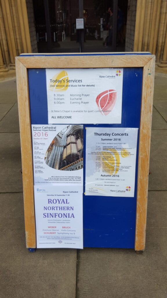
Over the years, this point has caused more difficulty with designers than all the others. In the posters below, the one on the right has got coloured images behind the text. It makes it harder to read, especially for older people and anyone with visual impairments.
If you look at any guidelines on accessible design, they all say to keep text bold, clean and simple – and don’t clutter with images. These government guidelines are an example. This doesn’t have to make for dull design – that’s the challenge for the designer.
5. What are your priorities?
The posters above are useful for another point. What information do you really want to stand out? The poster for the Royal Northern Sinfonia is great – this is what will probably initially draw in audiences?
The summer organ festival above probably needs re-ordering. The stand-out part of the poster is ‘2016’ but the bits you probably want to grab initial attention are ‘organ festival’ and then maybe dates eg ‘July and August’. Hopefully that will then draw in the passer-by to stop and pick up more detailed information.
6. Your logo is not the most important bit?
Years ago, we helped to promote a food festival for our local council. We organised 12’ banners to go on fencing by major roads around the town. But the branding guidelines for the council’s logo meant that in the end, half the banner was their logo. The festival name and date – the bit we wanted drivers to note and remember – ended up being so small that we worried drivers would crash their cars in trying to read it. There are times when logos are important – but not to take over the content that you want noticed.
So what’s your view? Is the look of a document more important than reading and remembering the messages? Do you agree that the examples above are poor design – or do you think they work?
PS my colleagues have pointed out that my photos aren’t exactly great! But they are the sort of photos that people take for social media these days – another consideration when we are considering comms and design.
